Whether you are buying some stuff from a local market store, walking on a street or simply scrolling the social media newsfeed, you are constantly surrounded by a huge number of logos knowingly or unknowingly. It may seem unimportant but these little images have a very strong impact on people in their daily routines. These logos help you to connect with the brands at subconscious level. Logos are inevitable if you are building a brand or trying to market your products and services globally.
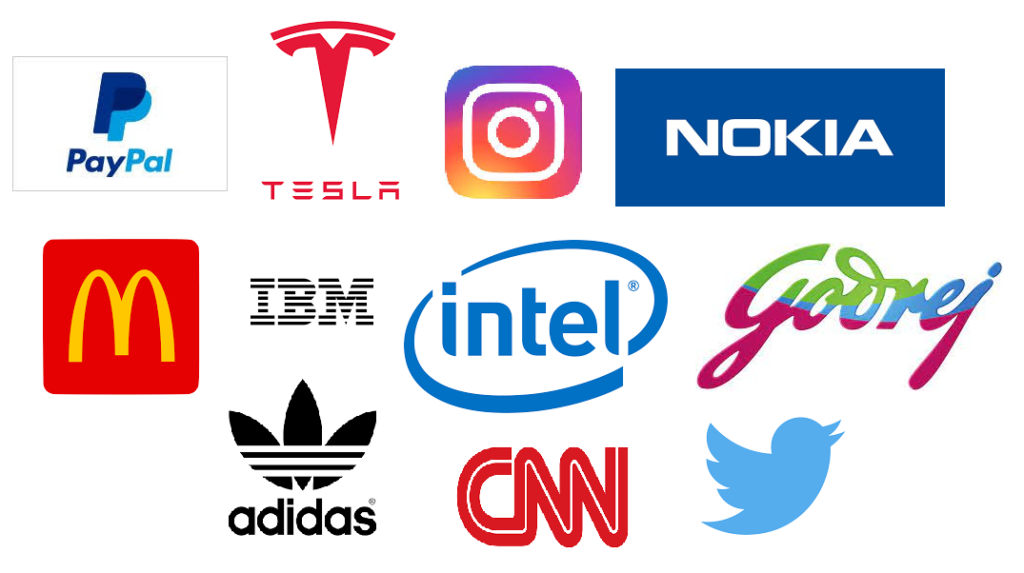
Look at these images. Seems familiar right? Just by having a glance you are able to connect with the brands and know who that company is, what they provide and how much you can trust them. Logo helps people to perceive your brand and becomes a big motivator for the organization. In this article we are going to explore logos, its types, its significance and how redesigning a logo over a period of time helps companies to boost their business to new heights.
What is Logo?
The aphorism “A picture is worth a thousand words” is perfectly suitable in defining the importance of a logo and its ability to connect with the people at a very deep level. Logo is an abbreviation for “Language Of Graphics Oriented”, it is a symbol which is made up of images and text designed to identify business, brand or company. It helps people to connect with brands instantly. A perfectly designed logo helps the company to establish its brand value and reach to the people’s mind immediately.
Different types of Logo
There are different types of logos but the most commonly used logos are described as follows:
1. Wordmark:
Wordmark is also known as logotype. It is the simplest logo because it consists of words/ text only. Some of the famous examples include Disney, Sony, Google, Yahoo, Coca-cola etc. Wordmark is considered as a good choice for a startup because the logo will contain the company’s full name and will help to make it known.
2. Lettermark:
Lettermark is also known as a monogram logo. It contains only one letter or an abbreviation, based on the initials of the company. It is a good choice for those companies whose names are too long and difficult to pronounce. Some of the famous examples include National Aeronautics and Space Administration (NASA), Home Box Office (HBO), Cable News Network (CNN) etc. Shortening the names of companies has its own benefits as it allows the audience/consumer to remember names quickly and logos for a long time.
3. Logomark:
Logomark is also known as a pictorial mark. It has no letters or words but an image, icon or symbol that represents the brand or company. Some of the famous examples are WWF panda, Apple, Twitter, the red cross symbol, instagram etc. Human brain connects with images, symbols and icons at a deeper level than to a written text thus logomark is a great way to build psychological connection between brand and consumers.
4. Combination mark:
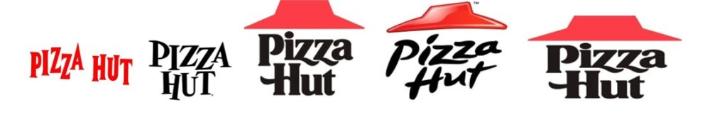
As the name suggests, it is a combination of symbol and wordmark. It gives a clear visual idea of the brand and also makes it clear what brand or company it is. Combination marks are useful when a company is new or less well-known. It makes your logo unique and distinctive and there are less chances of confusion with other brand logos. Some of the famous examples are Pizza Hut, McDonald’s, Walmart, Microsoft, Youtube etc.
5. Emblem mark:
Emblem mark also include both text and symbol but here the text is inside the symbol. These logos are less flexible because their elements are difficult to separate out. They are generally used by organizations like government agencies, charities, schools etc because this style of logo indicates authority and authenticity of organization. Some of the famous examples are Starbucks, MasterCard, Ford, Burger King, Harley-Davidson etc.
Features of a good Logo
A good logo is simple, scalable, relevant, versatile, memorable and appropriate. It instantly connects people with the brand of the company and ensures to build faith in products and services provided by the company. Good logos differentiate your company from other companies and it builds brand loyalty. It has a specific meaning in it. It reflects the belief system, values, purpose, mission and vision of the company. It resembles the spirit of your organization.
Importance of a well designed Logo
A well designed logo is very important because it shows that your company is professional, modern and believes in updating itself with changing market scenarios. A well designed logo has several benefits and some of them are mentioned here:
- It establishes your unique identity and separates you from your competitors.
- It grabs attention, builds customer loyalty, makes a good first impression and makes your company’s name memorable.
- It tells people who you are, what you do and how your products and services benefit them.
- It represents the asset and core value of a company.
- It gives clear indication to people about your business that you do great work without any prior experience.
- It reflects your brand identity. Think of the “Apple” logo and you will understand who that company is and what quality of products that they are offering.
- Good logo establishes a sense of trust and increases chances of repeated customers.
How will business impact if logo is not updated?
How people perceive your brand has a direct impact on the company’s business. An incredibly designed logo will not only boost business but also conveys a strong message that you are a professional and modern organization who never compromises on the quality of products and services. But having miserably designed logo or if the logo is not updated can have several disadvantages on brand value of a company. An outdated logo indicates that the company is not growing and changing itself with changing time, technology and customer requirements. That is the main reason why several companies keep redesigning their logos. With the launch of new products, services, brands a company is expanding in different horizons and to tell people how the company is growing it becomes important to redesign the logo and if not done it will indicate that the company is still on the same page from where it has started.
Importance of redesigning Logo
Consider a home which was built in the 1980s and just by looking at its walls, furniture and interior we can say that it’s outdated. Same thing applies to logos. If your logo is outdated or not updated it shows that the brand or company is not updating itself with the dynamic market. This is the main reason that companies keep changing or redesigning the logos to keep themselves updated, professional and relevant. An outdated logo looks unprofessional and creates doubt among customers about the product and services of the organization. Whereas a strong logo design stands out among competitors, builds brand, increases trust and creates positive association with the people.
But how do you know when is the right time to redesign a logo? Following are the key indicators which will help you decide that you need to update logo or not:
- When a company’s logo makes you feel that it is not relevant in today’s market. What was once modern can lose its effectiveness and beauty over time. You can consider updating your logo once every five years.
- With time things change. Your current business may not be the same with the vision you started years back. It has evolved and changed with the changing time, technology and requirements. Your earlier designed logo no longer reflects what you do and what you serve. In that case it’s very urgent to get a new logo or redesign the existing one.
- Your logo reflects the brand of the company. With changing times sometimes it is required to rebrand your organization and for that it is a good idea to give your old logo a polish to reflect how you want people to perceive your company.
Reputed companies that redesigned their Logos
There are unlimited examples of reputed companies who have redesigned their logo continuously to keep their brand relevant to ever changing market requirements. Some of the leading examples are as follows:
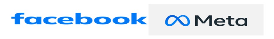
1. Facebook/Meta
This new logo has impacted powerfully to the viewers. The new infinity symbol and Meta name has enhanced a lot on the old Facebook logo. This redesign is really eye catching.
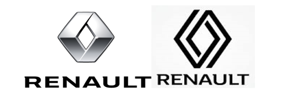
2. Renault
The Renault diamond has been redesigned no less than eight times! Nine, with the latest version. The basic, mathematical plan style of Renault’s new token adds a development that was deficient in the old one – with two parallel lines representing a vehicle’s wheels. The simple use of line gives this advanced logo a coherence and direction.
3. Nike
The Nike company has changed their logo almost 5-6 times. The Nike logo (check mark symbol) has been changing over a decade. The swoosh symbol is the shape of a wing of Nike, the Greek Goddess of Victory.
4. McDonalds
The McDonald’s logo has changed several times over the years. The first logo design was in 1940. McDonald’s needed to improve on their logo and work on marking the business. Picking the golden arch is McDonald’s needed to improve on their logo and work on marking the business. Picking the brilliant move to innovate their Restaurant.
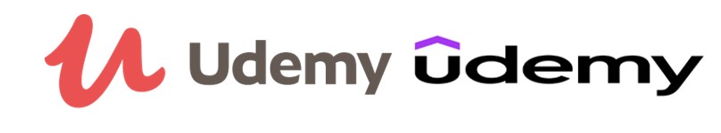
5. Udemy
Udemy marks out their logo as ‘A logo that focuses us north. Whether you look for it or offer it, information is inspiring and knowledge is increasing. This logo is a symbol of growth universally.
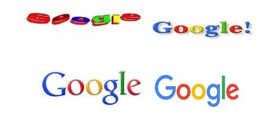
6. Google
Initially Google was in bold font style with a different colour combination from the “G” icon we use today. Then it was updated with an exclamation sign “Google!” with the same colour combination. After that it was changed and the exclamation sign was removed. And now google icon has dramatically transformed with the lettering maintaining its predecessor’s multicolour pattern, the sleek new Google font, Product Sans (font style), was a refreshing departure from the old serif font. The simplicity and brightness of the logo made it truly iconic and instantly recognizable.
7. BMW
BMW’s redesigned logo has a transparent, flat design that reinterprets its previously metallic emblem. In place of the classic black outer ring (now completely transparent), 3D effects and lighting effects have been removed. In addition to the circle logo, the white and blue colours of the company’s home state, Bavaria flag, remain.
8. Hyundai
There’s no doubt that everyone knows the italicized “H” on Hyundai’s cars. Hyundai’s logo is a stylized picture of two individuals shaking hands, but it also represents the company’s name. Their exchange is a handshake of trust and satisfaction between company and consumer. Also, the “H” is slanted forward, actively to the right, rather than passively to the left. The oval is an indicator of Hyundai’s presence across the globe, its aim being to flourish in international markets far beyond Asia.
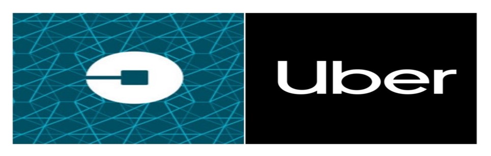
9. Uber
Uber has updated its logo and brand design in a major rebranding campaign. It has been replaced by simple text that says “Uber” and is a clear departure from its old logo with the square in the middle of a circle. The Font is specially designed for Uber, and it contains some hidden imagery as well- the U looks like a road, and the zoom in effect appears as the app opens.
10. Pizza hut
Pizza Hut’s logo is undoubtedly one of the most recognised in the world. Its earliest version was introduced in 1958, and debuted on the signage of the first pizza hut store. Since there was an insufficient amount of space on the sign, the brand name was only displayed in a sans serif font.
Design logos with TRIOT
We have gone through the various types and significance of redesigning logos over time to keep yourself updated. You can pick any type of logo for your company however attentive design is essential, it will elevate your brand and make your customers remember you for years.
If you hunting for simple, scalable, relevant and enduring logo, TRIOT is here. TRIOT is a team of dedicated, enthusiastic and hardworking people who provide the best logos which will help you to build your brand and enable you to build customer’s trust in the services and products provided by you. Our custom-made logo symbols are impressive, appropriate and also help you to connect with your customers at great level.